History fascinates me… How wars started, were fought and were won. How the politics of a nation influenced its rise and fall. How small, seemingly unimportant decisions by seemingly unremarkable men changed the direction of the world.
And how the wonderful world of computer and video games has evolved over these 2 or 3 decades! The history of electronic games really grabs me, their ups and downs, corporate blunders and revolutionary successes.
A lot of these facts are plain old fun to delve into – such as how in 1982 Atari released 12 million copies of the Pac-Man game… Even though there were only 10 million Atari owners to use the games. Or how E.T. the Extra-Terrestrial caused the Great Video Game Crash of 1983.
Being fun stuff therefore, these posts will be under Fun Fun Doodle Dum. Although they are also factual, these kind of facts aren’t really useful or deserve undue concern, so they won’t be under That’s A Fact. And so having been said, I present to you my first offering in video game history…
—————
Argh! Quick, cover my eyes! It’s Really Bad Video Game Box Art!
Goodness, gracious me! These examples of video game box art are so bad… They’re great! In a ‘split my sides laughing’ and ‘slap my head in disbelief until I’m retarded’ kind of way.
You can read the mocking article in its entirety right here.
I’ve picked out some of the really strange/lame box arts below, and provided screen shots of the actual game and other, non-lame artwork of the game so that you can compare.
BLACK BELT

A disembodied foot pinning a colourful paper cut-out star to a tiled wall. Um, yeah, pretty descriptive art. It doesn’t even show the titular Black Belt. Compare actual game:

BUST-A-MOVE


A fun, colourful puzzle game featuring the well-known Bubble Bobble dinosaurs… But not if you believe the box art! I mean, could a 10-year old really convince his parents to buy a game with the first artwork? Compare the Japanese version (named Puzzle Bobble) and the actual game:


MEGA MAN
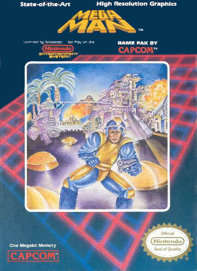
This one is so unbelievably atrocious, it’s my personal ‘favourite’. Now with Pac-Man (the next entry), it was forgiveable – the artist couldn’t see what Pac-Man actually looks like as a living character. But there’s no excuse for the American artwork dudes!
From cute kid robot, to middle-aged coffee-punk. Compare the actual game, clearly showing Mega Man firing his buster:

And the current interpretation of Mega Man (Rockman in the original Japanese):


UPDATE 6 August 2008: Mega Man 9’s promo art returns to the roots of bad taste!
UPDATE FEB 2012: Well, this explains the sudden influx of searches for Megaman Bad Box Art.
Via Dueling Analogs, the box art Megaman will be a playable character in Street Fighter X Tekken 3:
Yes, he looks like he put on 20-30 years since the bad box art. Realism, yo!
PAC-MAN
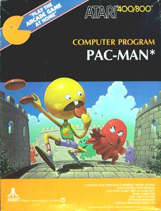
Everyone knows the famous game Pac-Man. But I bet you didn’t know about this surreal and somewhat annoying art for the original American release!
Gotta cut the artists some slack, however. I mean, how do you interpret artwork for a game where the main character is a yellow pizza with a mouth?
Compare the Japanese stab at it: Pac’s got a nose here, but somehow looks more sellable than the above artwork. Btw, Pac-Man is of Japanese origin.

Artwork on the American game cartridge itself hit a little closer to home:

It’s actually very close to the modern interpretation of the character:

And just in case you’ve forgotten what the in-game Pac-Man originally looked like, here’s a screenshot from history. Classic.

PHALANX

Uh, now this just confuses me. What do a country banjo player and a spaceship shooting game have to do with each other? I recall one of the space-faring Silverhawks having a guitar theme (see this site), but…
Anyway, at least they got the spaceship fairly accurate.


The Japanese box art for comparison (somewhat phallic mind you):

PRO WRESTLING

Once more for the Sega Mega Drive, you can see the obvious similiarities with Black Belt’s art style. This time it’s a detached head instead of a foot though. The game itself:

Finally, for another comparisons-of-box-art tour, visit this 1up.com article where you can learn more about the reasons behind changes in artwork direction and see this:

Yes, that is supposed to be Mario!
And that’s all for today, folks! I hope you’ve enjoyed the trip down the hallways of videogame history. Sorry about the way ugly paintings on the walls though!

March 1, 07 at 11:52 am
man, what is wrong with the art director? i dont see how a county banjo player connects with an intergalactic space mission. crazy! hilarious post tho. brings some more.
January 6, 08 at 5:50 am
I suppose I can shed some light on the terrible look of the Mega Man boxart. Since I’m a sort of hard core Mega Man fan, I spent some time looking into the making of the games.
The reason the art was so bad was because of the fact that the original artist left within hours of the deadline for the artwork, since there was no one to do it though, one of the developers contacted his artist friend and had him do the art. Capcom had to settle for what they got.
Hey, it’s better then ‘Black Belt’, right? I mean, at least Mega Man’s art in some way almost resembles the game. Right?
January 7, 08 at 8:38 am
Great info J, any links you can provide?
And yes, Black Belt and its Megadrive ilk really are the worst of the worst.
July 8, 08 at 12:56 am
you can play the original Bubble Bobble game here
http://armastevs.com/play-701.html
September 25, 08 at 1:07 am
[…] *Manuals, do we need ‘em anymore! Old school manuals were cool.. “Notes” Case talk too! […]
October 21, 10 at 7:16 pm
I must disagree on one cover: Super Bust A Move for PS2. It’s so bad it’s actually awesome. I’ll take that with coffee any day. Except the diapers.
September 30, 11 at 1:25 pm
gameplay trailer, gameplay trailers…
[…]Really Bad Video Game Box Art « LEADING MALAYSIAN NEOCON[…]…
February 29, 12 at 12:16 am
Game Review Sites…
[…]Really Bad Video Game Box Art « LEADING MALAYSIAN NEOCON[…]…
December 26, 12 at 9:10 am
The Person That Drew The Megaman1 box art Needed To Do It In No Little Time At all he did not see screenshots of the game either.
January 25, 13 at 12:02 pm
Aw, this was an extremely nice post. Finding the time and actual effort to create a great article… but what can I say… I procrastinate a lot and don’t seem to get anything done.
December 11, 13 at 10:51 pm
In many countries, solar panels face the realities of northern
climates – snow. These machines can be picked up at most hardware stores or even online with free shipping.
One of the most outstanding differences is that
the Compact 22 covers up to 22 inch clearing width while the Compact 24 covers up to 24 inch
clearing width.
June 19, 14 at 4:45 am
I am sure this paragraph has touhed aall the internet users, itts reaally
really ggood post on building up nnew wweb site.